RIO
OUAGA #05
Siemens Illustrations
Developing an illustration style for Siemens AG

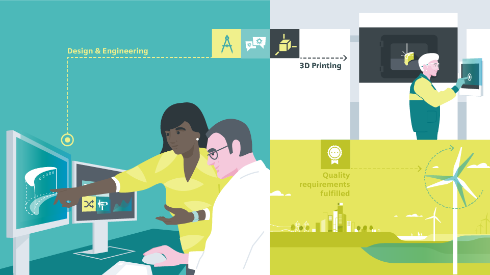
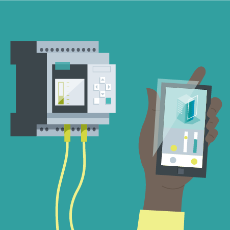
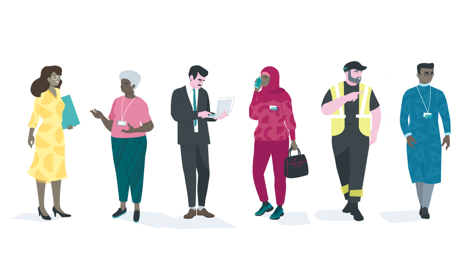
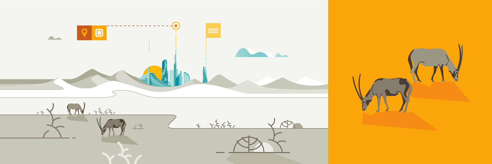
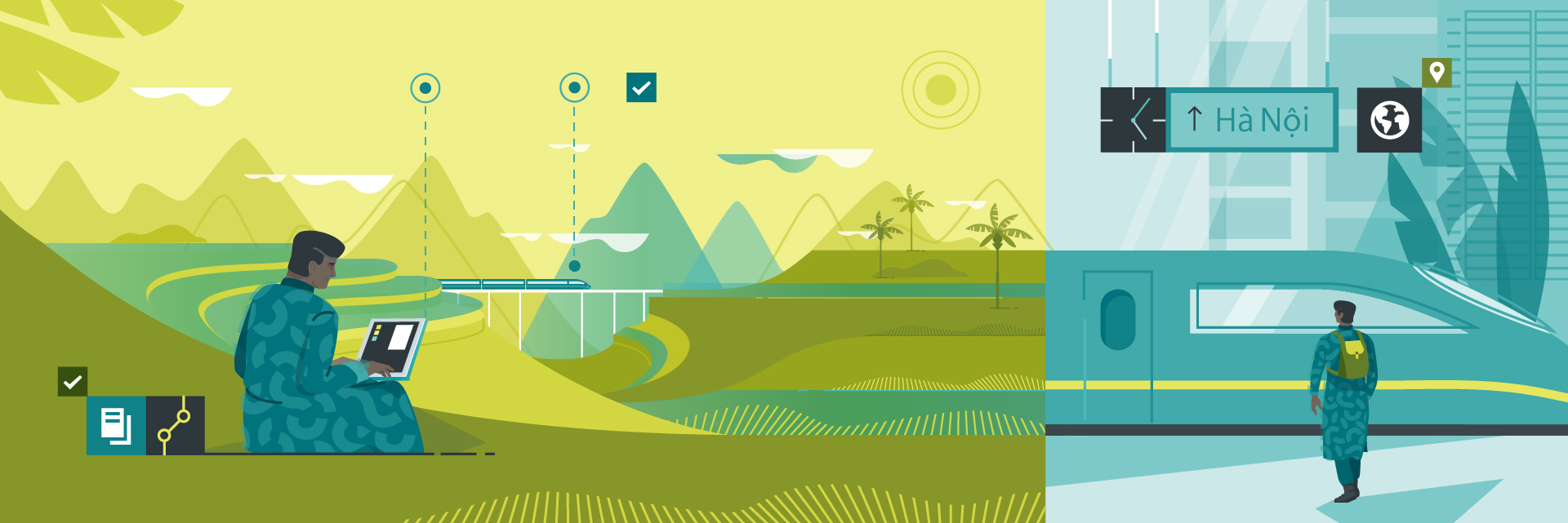
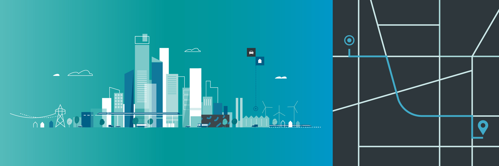
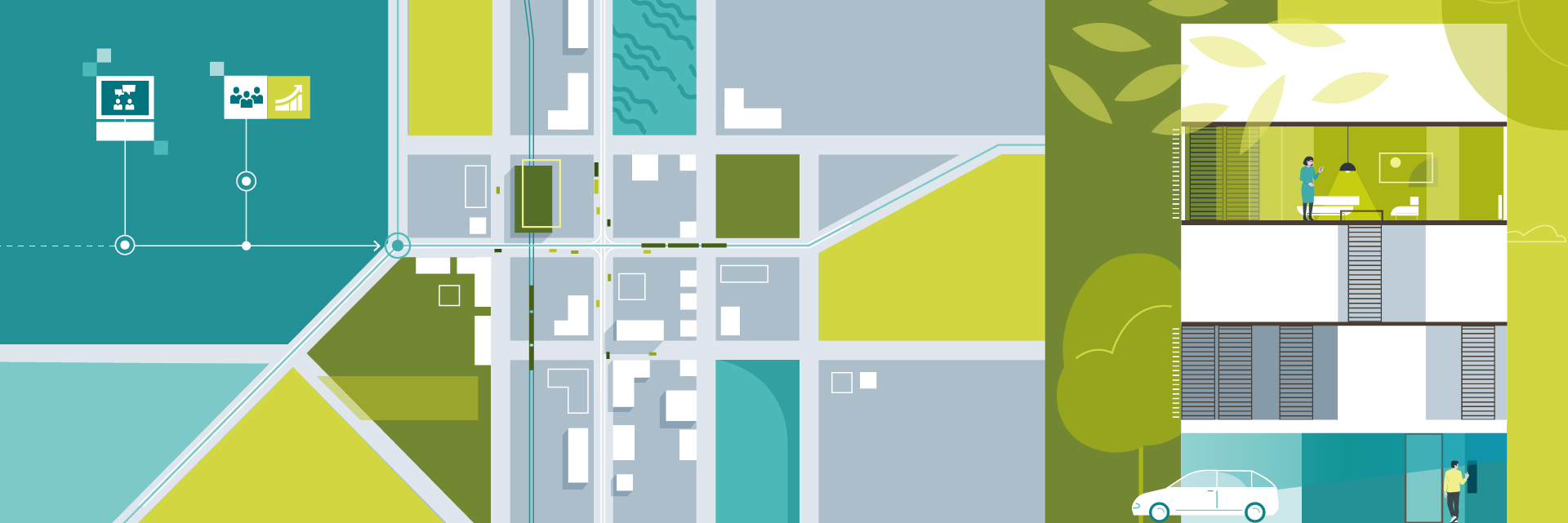
In cooperation with META Design Berlin we developed a visual style for SIEMENS Illustrations that characterizes SIEMENS while differentiating the brand from it’s competitors. Therefore we created a functional yet friendly look that reflects the clean and technical design language at the core of the SIEMENS brand. By adding a playful touch using organic shapes and vibrant colours we made the overall feel more approachable for a broader audience. And no matter what the use: Regardless if it’s content for websites, social media or print, the illustration tools need to cover all bases and allow for scalable designs.

The Task at Hand


SIEMENS’s extensive product portfolio requires an illustration style that can be easily adapted to various requirements. Wether it’s depicting digital solutions or hardware products, interpersonal experiences at the work space or day to day life, visualizing intricate processes or just creating the`good old infographic’ - the illustrations need to be able to adjust to varying levels of complexity and abstraction.

Playful minimalism


As the main principle we introduce a combination of streamlined shapes and outlines to follow the technical aspect at the core of the SIEMENS brand. Further we add overlapping shapes and organic pattern to achieve depth and a more playful feel of the Illustrations.

Overall the proportions are kept within the realistic realm but different perspectives can be combined to achieve complexity or add an element of surprise. To ensure the Illustrations always convey a clear message we use as they are always easy to understand and condense specific information to the max.

Dynamic Petrol and Accent Teal are the strongest color assets of SIEMENS and promote instant brand recognition as they have been used favorably in prior designs. To add a more vibrant feel to the spectrum we incorporate a stronger use of the brand’s accent colors in the new design language.
The whole range


The diverse product portfolio of SIEMENS ranges from small electronic parts to massive machines as well as from digital services to physical products. The illustrations cover that by being as specific as necessary but as minimal as possible, always ensuring the products remain recognizable.
🌈 Diversity


As a global operating company, people from all walks of life are part of the SIEMENS family - the Illustrations reflect that. Diverse characters embrace life and include all ages, abilities, body types and races thus evoking belonging and inclusivity.

People are shown in a simplified but realistic way. They always have an approachable attitude in which patterns, colourful clothing or hair as well as accessories are used to highlight personality and individuality.
Telling the Story


Illustrations help shedding light on complex topics in an easy-to-understand way as they turn abstract ideas that are difficult to depict into a relatable experience. In combining real life settings with condensed layers of information, Illustrations are able to tell a story in a way a photo could not! Thus they come in extremely handy when dealing with futuristic topics or complex subject matters that the audience might not (yet) be familiar with. Often that’s the case in the field of digitalization or augmented reality, as the idea of a product here is often intangible and does not exist in “the real world”.
Instagram Stickers


Illustrated stickers help to engange between peers as with an audience outside of SIEMENS in a fun and emotional way. As they are pretty much limited to personal use pushed the boundaries within the SIEMENS style palette a bit more.

To grab them yourself, head over to your instagram stories and type „Siemens“ in the sticker search bar.
Credits

Client Siemens AG

Agency Meta Design Berlin
Design & Illustration Agata Malinowska, Hendrik Woitkowiak, 908
Animation Artists Chris Ott, Thibaut D’Alton, Daniel Zat, 908

Production by 908